A Framework to Evaluate Musculoskeletal Models of Care A Framework to Evaluate Musculoskeletal Models of Care A Framework to Evaluate Musculoskeletal Models of Care A Framework to Evaluate Musculoskeletal Models of Care

Feature Gallery

Models of Care

A framework for change

A Framework to Evaluate Musculoskeletal Models of Care was designed and produced for Curtin University. The publication was released with the support of over 40 organisations worldwide.

Nikki M Group provided services including:

  • graphic design
  • cover design
  • typesetting and layout
  • image research
  • print management
  • digital PDF interactivity
  • information graphics.

Target demographic

The target audience for this document is clinicians and policy makers. The design targets the audience using:

  • a san-serif font with humanistic qualities
  • optimal text measure and font size for efficient reading
  • imagery relating to the musculoskeletal industry: skeletal structure, target population, urban environment and clinical practice
  • colour palettes that are clinical, clean, bright and vibrant
  • layout design in the form of an official report.

“We thank Nikki M Group for providing a consistently very high level of service to us. We are so impressed by the timely communication, helpful advice, efficient revisions and expert design.”

Associate Professor Andrew Briggs
School of Physiotherapy and Exercise Science
Faculty of Health Sciences
Curtin University

Publication design

Design features include:

  • facing pages for print
  • balanced margins for digital use
  • sans-serif body copy
  • left-aligned paragraphs
  • two column layout
  • section openers
  • photographic imagery
  • diagrams and flowcharts.

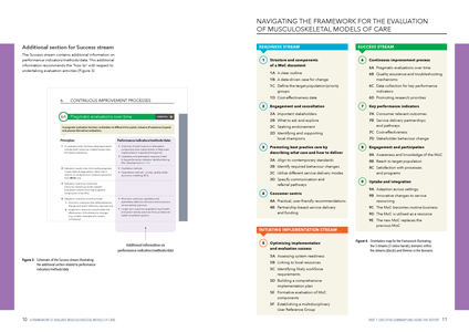
Double-page spread showing two column layout, information graphics and colour palettes.

Double-page spread showing two column layout, information graphics and colour palette.

Digital PDF interactivity

Produced for both print and digital distribution, Nikki M Group set up digital PDF interactivity including:

  • table of contents with page links
  • reference links to endnotes
  • URL hyperlinks
  • metadata.

Design for education

Maximise your resources for learning.

Request a quote

Call +61 3 9584 6021

Talk to us about your project

  • Need to design a book or research report?
  • Want custom cover design that is unique?
  • Do you want cost-effective
    short-run printing?

Colour composition

Three colour palettes define sections and design elements:

  • sections – bright colours
  • framework – vivid colours
  • diagrams – deep colours.

The colour palettes have different hues. This creates a layering effect, defining design elements and forming an information hierarchy.

Bone-colour tints and slate greys run throughout the document, accentuating the colour palettes.
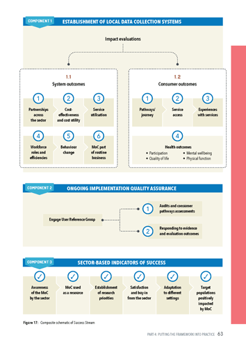
PEARL Learning Materials for Tonga: spread from the Student Activity Book

The page above shows a bright section-colour, in the margin, and a deep blue, in the diagram, accentuated by tints of bone.

Accessibility

Text flow and typographic arrangements have been designed to allow for screen readers to follow and read content.

CONCEPT DESIGN

Testing ideas, reasoning and problem solving

Do you want to transform a text document into a terrific publication? Nikki M Group can design concepts that define the overall look and feel of a publication before typesetting.

Conceptualising ideas will give your publication a great head start.

Fast facts

Total pages

76